top of page

Aquamarine Thoughts - My Blog


Few colors in history carried as much power, rarity, and symbolism as purple.


Long before luxury branding existed, Purple and Argaman dyes were associated with royalty, exclusivity, spirituality, and authority, becoming some of the most precious pigments of the ancient world.


Purple In the ancient world:


For centuries, purple dye was incredibly expensive and difficult to produce.


The famous “Tyrian Purple” (Argaman) pigment in the ancient Mediterranean was extracted from sea snails living along the Mediterranean coast, especially species such as "Bolinus Brandaris", known as the "spiny dye murex".


Since only the wealthy could afford it, purple became psychologically linked with:


  • Exclusivity

  • Prestige

  • Sophistication

  • Power

  • Status


The Phoenicians became legendary for producing this extraordinary pigment, a process so difficult, expensive, and time consuming that purple fabrics became accessible almost exclusively to kings, emperors, nobility, and religious authority figures.


Color itself became hierarchy & a status symbol:


Archaeological evidence of these sea snails was even found in ancient regions such as Cyprus, Italy, and Spain, connecting purple to trade, wealth, civilization, and power for thousands of years.


In the Bible, Argaman appears repeatedly alongside tekhelet and scarlet fabrics in sacred ceremonial descriptions, including in the Book of Exodus:“Blue, purple, and scarlet yarns…”


Purple was never just decoration.

It was status, authority, rarity, and sacred symbolism woven into fabric itself.

That ancient psychological association never disappeared.


Even today, purple continues to communicate exclusivity, prestige, luxury, creativity, and elevated perception in modern branding systems.

It simply evolved into branding.


Purple role today:


Purple sits between blue and red on the color spectrum, thus, occupies one of the most fascinating positions in visual identity systems because it sits between two psychological worlds:


  • Blue brings trust, intelligence, stability, calmness, and professionalism.

  • Red brings passion, energy, emotion, stimulation, and visibility.


That balance gives purple a unique ability to feel premium, artistic, bold, emotional, luxurious, and unconventional all at once.


  • Violet Vs. Purple 🫟


  • Violet


Is the pure spectral tone directly connected to light itself.

Historically, it became associated with royalty, spirituality, authority, and elevated status.


  • Purple


Is the modern branding interpretation.

A blended tone that adapts across industries for emotional impact, differentiation, and memorability.


The Psychology of Purple in Branding:


In branding, color is never random!


Before a customer reads a slogan, understands a service, or experiences a product, the brain already reacts emotionally to color.


And among all branding colors, purple remains one of the rarest, boldest, and most psychologically complex choices.


Positioned at the edge of the visible light spectrum, purple is often perceived as one of the most powerful and transformative colors in nature, blending emotional intensity with depth, mystery, and imagination.


Even today, brands unconsciously benefit from that historical association.

That is why purple is frequently chosen by companies that want to appear elevated, premium, artistic, or visionary.


From Luxury to Streaming:

How Different Industries Use Purple Psychology?


Not all purple tells the same story...

Here are some of the stories behind the World’s Most Famous Purple Logos!


Entertainment, Fantasy & Imagination Brands


Purple is one of the dominant colors in entertainment and fantasy branding because it instantly creates a sense of imagination, magic, wonder, and emotional escapism. For example:


  • The Walt Disney Company


The Walt Disney Company is a global entertainment and media conglomerate headquartered in Burbank, California. Founded in 1923 by Walt and Roy O. Disney, it has grown into one of the world’s most influential entertainment enterprises spanning film, television, theme parks, and streaming. Its operations combine creativity, technology, and storytelling to shape modern popular culture


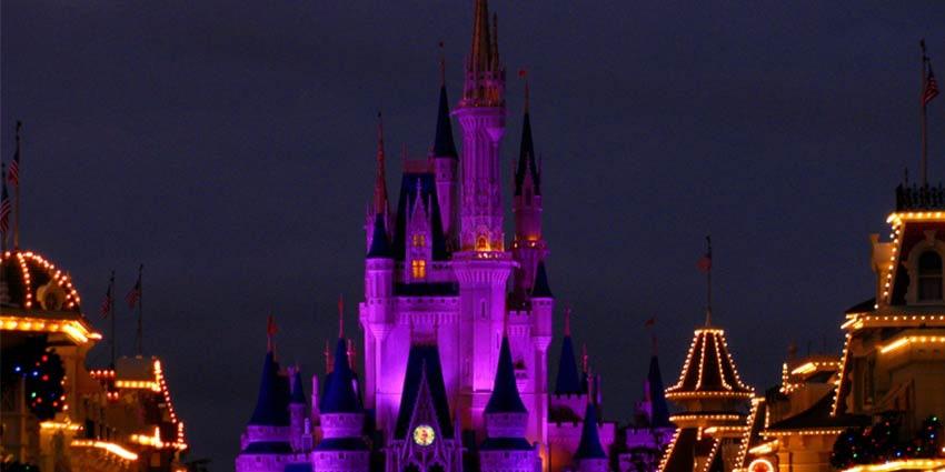
The Walt Disney's Branding frequently uses deep blue-purple gradients across castles, fireworks, Disney+, and fantasy visuals because purple psychologically reinforces:


  • magic

  • imagination

  • emotional immersion

  • dreamlike storytelling


The iconic glowing castle became associated with a surreal emotional universe rather than ordinary entertainment.


Disney’s purple tones are rarely harsh or neon.

They are cinematic, atmospheric, and emotionally layered, helping audiences feel transported into another world.


  • Roku


Roku is an American streaming platform and consumer electronics company that builds the software and devices many households use to watch internet TV. It combines hardware (streaming players and smart TVs) with an advertising- and data-driven platform business that distributes streaming apps and its own free ad-supported service, The Roku Channel.


Roku's Branding - Premium Entertainment & Simplicity

Unlike brighter tech brands, Roku uses a darker royal purple that feels:


  • sophisticated

  • cinematic

  • mature

  • premium


The simplicity of the logo allows the color itself to become the emotional signature.

Roku’s purple positions the brand closer to premium entertainment experiences rather than playful social media culture.


  • Chocolate, Food & Sweet Brands


Purple is heavily associated with indulgence, richness, comfort, and premium emotional experiences in the food industry. Especially in chocolate branding, purple elevates products from simple sweets into emotional, luxurious experiences.


For example:


  • Cadbury


Cadbury is a British confectionery brand known for its chocolate and cocoa-based products. Founded in 1824 by John Cadbury in Birmingham, England, it is now owned by Mondelez International. Cadbury is one of the world’s largest and most recognizable chocolate makers, with iconic products like Dairy Milk and Creme Egg sold in over 50 countries.


  • Cadbury's Branding


Cadbury’s famous royal purple became so strongly associated with the brand that it evolved into a protected identity asset in multiple markets.

The deep purple transforms chocolate from a simple snack into something:


  • indulgent

  • premium

  • comforting

  • emotionally rewarding


The gold details often paired with the purple reinforce luxury and heritage even further.


  • Milka


Milka is a Swiss-origin chocolate brand established in 1901 by chocolatier Philippe Suchard and now owned by Mondelez International. Known for its lilac packaging and the “Lila” purple cow mascot, Milka is one of Europe’s most recognizable milk-chocolate brands, prized for its creamy texture derived from Alpine milk.


  • Milka's Branding - Softness, Warmth & Approachability


Unlike Cadbury’s royal luxury positioning, Milka uses soft lavender-purple tones to create:


  • warmth

  • gentleness

  • nostalgia

  • comfort


The softer shade makes the brand feel friendly, emotional, and family-oriented rather than elite or luxurious.


Even the famous Milka cow reinforces the brand’s calm and approachable emotional identity.


Sports, Prestige & Legacy Brands


In sports branding, purple is often chosen to create a sense of prestige, exclusivity, legacy, and iconic identity. For example:


  • The Premier League 


Premier League uses purple to blend prestige, passion, and modern sports entertainment, reinforcing its identity as one of the world’s most iconic football brands.


  • The Wimbledon Championships - Prestige, Tradition & Royal Elegance


Wimbledon combines deep purple with green to communicate prestige, heritage, exclusivity, and timeless British elegance.


The purple reinforces the tournament’s royal and elite identity, helping it feel more ceremonial and iconic than a typical sports event.


  • Los Angeles Lakers - Fame, Power & Showtime Culture


The Lakers’ famous purple and gold identity symbolizes luxury, dominance, celebrity culture, and championship legacy.


The bold purple became strongly associated with the “Showtime” era, transforming the team into both a sports franchise and a global entertainment icon.


  • Baltimore Ravens - Strength, Mystery & Intensity


The Baltimore Ravens use dark purple to create a feeling of power, intimidation, mystery, and emotional intensity.


Combined with the raven symbol, the color gives the brand a dramatic and aggressive identity that stands apart from traditional NFL (National Football League) color palettes.


Technology, Communication & Community Platforms


Many modern digital platforms use purple to appear creative, expressive, innovative, and community-driven. For example:


  • Discord


Discord is a privately held American technology company that operates a real-time voice, video, and text communication platform. Founded in 2015, it began as a chat service for gamers but has since evolved into one of the world’s leading social platforms for online communities, with more than 200 million monthly active users across gaming, education, and creative sectors.


  • Discord's Branding - Community, Gaming & Digital Connection


Discord’s famous “blurple” color, a mix between blue and purple, was intentionally created to balance trust with creativity and community energy.


The logo itself resembles a friendly game controller face, reinforcing the platform’s origins in gaming culture while making the brand feel approachable, social, and interactive.


Over the years, Discord refined its purple identity into a cleaner and more modern digital aesthetic, helping it evolve from a gamer chat app into one of the world’s strongest online community platforms.


  • Twitch


Twitch is a live-streaming platform primarily focused on video game broadcasting, creative content, and real-time viewer interaction. Founded in 2011, it has become one of the world’s largest destinations for live entertainment, especially among gaming and esports communities. It enables streamers to build audiences and monetize their content through subscriptions, ads, and donations.


  • Twitch's Branding - Community, Creativity & Digital Culture


Twitch chose bright digital purple to separate itself from traditional corporate tech brands dominated by blue.


Its purple evolved over the years from a darker gamer aesthetic into a cleaner and more vibrant digital identity that feels:

  • interactive

  • energetic

  • youthful

  • creator-driven


The color helped Twitch become instantly recognizable inside gaming culture while still feeling emotionally expressive and community-focused.


Purple also works exceptionally well on screens, making Twitch visually dominant in streaming environments.


Emotional, Greeting & Sentimental Brands


Purple is also used by brands built around emotional connection, memories, celebration, and meaningful experiences.


In these industries, purple creates a feeling of warmth, sophistication, nostalgia, and emotional depth without becoming overly dramatic.


  • Hallmark


Hallmark Cards, Inc. is a privately held American company known for its greeting cards, gift products, and media ventures. Founded in 1910, it has grown into one of the world’s largest creators of personal expression products and operates media channels reaching millions of households.


  • Hallmark's Branding - Emotional Depth & Timeless Elegance


Hallmark uses deep purple to communicate emotional depth, elegance, warmth, and timeless sophistication, helping the brand feel both personal and premium.


Hallmark uses deep purple to communicate:


  • emotional sophistication

  • warmth

  • trust

  • sentimentality

  • timelessness


The crown symbol strengthens purple’s historic association with prestige and emotional value.


Rather than demanding attention, Hallmark’s purple creates intimacy and emotional connection.


Why Purple Continues to Dominate Across Industries?


Whether used by entertainment giants, luxury chocolate brands, streaming platforms, or emotional lifestyle companies, purple consistently helps brands communicate one core idea:


  • This brand offers more than a product.

  • It offers an experience, identity, emotion, or transformation.


That is why purple remains one of the most psychologically powerful colors in modern branding.


Purple also performs well digitally because it stands out in crowded interfaces dominated by blue.


💜 If purple feels like the language of your brand


Let’s talk!


AquaMarine Design Studio


Instagram: aqm.design


Long before

a customer reads a slogan,

opens a website,

or enters a store,

color has already

shaped their first impression!


And no color has mastered that silent psychological influence quite like BLUE.


Across decades of modern branding, blue became the universal language of trust, structure, authority, and stability.


From financial institutions to technology giants, the color repeatedly appears in industries where reliability is not optional but essential.


This is not simply a design trend.

It is deeply connected to human perception.


Blue naturally creates a sense of calm and order.

Unlike red, which accelerates emotional response, or orange, which creates movement, blue slows visual tension down. It feels controlled. Rational. Stable.


That emotional effect is exactly why some of the most powerful corporations in the world built their identity systems around it:


  • JPMorgan Chase 

Uses dark institutional blue to reinforce financial authority and long term stability.


  • American Express 

Rrelies on blue to communicate security and credibility in a highly sensitive financial environment.


  • IBM , HP

Became so strongly associated with blue that the company earned the nickname “Big Blue,” turning color itself into corporate identity.


In the digital world, blue became almost impossible to separate from communication itself!


  • Facebook 

Built its entire visual identity around blue to create familiarity, accessibility, and social trust at global scale.


  • LinkedIn 

Uses blue to reinforce professionalism, networking, and structured communication. Even the legendary blue bird of:


  • Twitter 

The iconic blue bird of Twitter became one of the most recognizable symbols in internet history. A perfect example of how deeply blue became associated with visibility, information flow, public conversation, and social interaction.


To this day, many people still associate the platform more with its legendary blue bird than with the colder and far more generic X rebrand..


  • Meta 

The entire Meta ecosystem further strengthened blue as the defining color of social media itself.


For billions of people around the world, blue became visually connected with communication, networking, messaging, feeds, notifications, and digital interaction on a daily basis. Blue also became inseparable from the language of aerospace and space exploration.


Celebrated and Distinguished Aerospace Organizations Like:


  • NASA 🚀✨


Few logos in history prove the power of blue better than NASA.


The original NASA insignia, nicknamed the “Meatball,” used deep blue to represent space, Earth, science, and exploration, combined with stars, orbital motion, and the iconic red vector.


In the 1970s, NASA shocked the design world by replacing it with the minimalist “Worm” logo, a futuristic red typographic system that became one of the most influential rebrands in modern design history. Clean. Geometric. Radical for its time.


Decades later, the return of the classic blue insignia proved something fascinating about branding psychology:people did not only miss the logo.They missed the emotion, trust, wonder, and identity connected to it.


NASA is a perfect example of how visual identity is never just aesthetics.


It becomes memory, perception, culture, and collective imagination.

Entire branding schools could be built just from studying that evolution alone.


The story of blue in branding goes deeper ..

Blue carries a fascinating contradiction:

it feels emotionally distant, yet psychologically reassuring.


That balance makes it uniquely effective for industries that must appear intelligent, dependable, and organized without becoming emotionally overwhelming.


This is why blue dominates sectors such as:


  • Banking and finance

  • Hi end Technology and AI

  • Aerospace and engineering

  • Enterprise systems

  • Infrastructure & computing

  • Social Media Platforms

  • Healthcare systems

  • Insurance and consulting

  • Social media and digital communication


In branding psychology:


Blue creates what designers often call “cognitive safety.”

People instinctively associate it with logic, consistency, and systems that function correctly.


Not every blue

tells the same story..


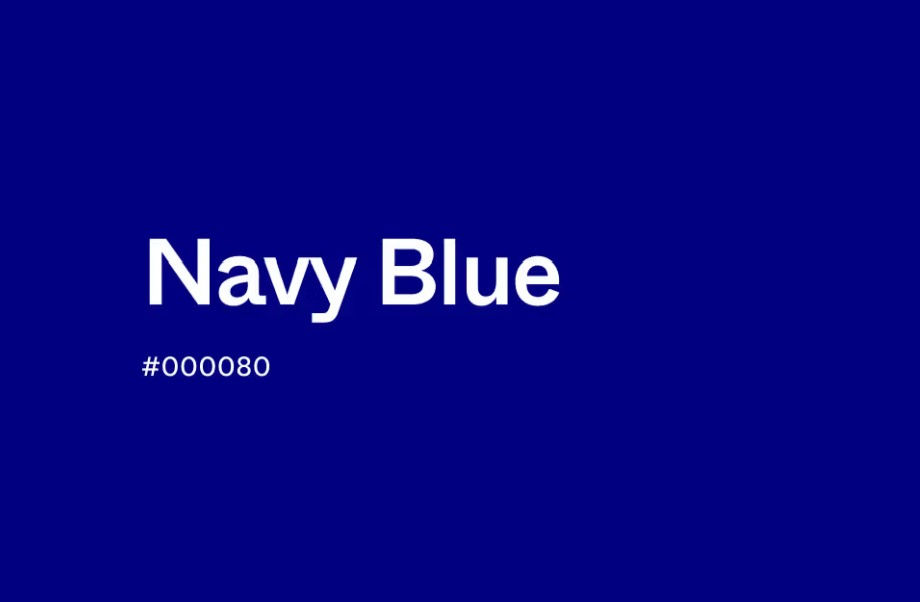
  • Navy Blue

Signals legacy, authority, and institutional power.


  • Royal Blue

    Feels confident and visible.


  • Neon Blue

Introduces innovation, speed, and technological energy.


  • Soft Muted Blues

Create calm and accessibility. The exact shade matters because color is never neutral. Every variation changes perception.


  • Baby Blue

Creates softness, calm, innocence, and emotional accessibility, which is why it is often used in wellness, childcare, beauty, and lifestyle branding.


That is why strong branding is not about choosing a beautiful color.

It is about choosing the emotional architecture behind it.


Blue is trust made visible.


If blue feels like the language of your brand, let’s talk.


If BLUE 💙

is the essence of your brand

Let’s talk!


AquaMarine Design Studio


Instagram: aqm.design


There are colors people simply see.


And then there are colors people feel before a single word is spoken.


Aquamarine, turquoise, and soft ocean inspired tones belong to a rare category of colors that create an immediate emotional response in the subconscious mind.


They communicate calmness, trust, elegance, clarity, spirituality, and emotional depth almost instantly.


For centuries, these shades have appeared in nature, sacred art, royal jewelry, architecture, fashion, luxury branding, wellness spaces, and visual identity systems because they trigger something deeply human: the desire for peace, meaning, beauty, and emotional balance.


For modern brands, especially those targeting sophisticated audiences in the United States and North America, these tones are far more than aesthetic choices. They are strategic psychological tools within luxury branding, visual identity design, and emotional marketing.


The Psychology Behind Aquamarine & Turquoise


Color psychology research continues to show that cool blue-green tones influence perception in powerful ways.


Aquamarine sits between blue and green on the spectrum, allowing it to combine the emotional effects of both:


• Blue is associated with trust, intelligence, stability, professionalism, spirituality, and authority.


• Green is related with renewal, harmony, growth, wellness, nature, and emotional balance.


Together, they create a color language that feels emotionally safe, elegant, refreshing, and refined.


This is one reason why aquamarine branding often feels “expensive” without appearing aggressive or loud.


Unlike heavily saturated luxury palettes built on black, gold, or red, ocean inspired palettes create a quieter form of prestige. They suggest confidence without forcing attention.


That subtlety is exactly what many modern consumers, particularly women entrepreneurs, wellness focused audiences, and luxury clients, are increasingly drawn to.


Why Ocean Colors Feel So Powerful in the Subconscious Mind


Humans are biologically connected to water.


Psychologists and neuroscientists studying environmental perception have long explored how water influences emotional regulation and cognitive calmness. Natural ocean tones are associated with openness, safety, oxygen, flow, and mental clarity.


This explains why coastal color palettes are frequently used in:


• Luxury hospitality branding

• Wellness and beauty industries

• High end skincare packaging

• Spa and retreat design

• Jewelry and fashion branding

• Premium lifestyle brands

• Holistic and spiritual businesses

• Interior design and architecture


Soft turquoise and aquamarine tones reduce visual tension while maintaining sophistication. They create emotional breathing space.


In branding, this becomes extremely valuable.

A brand that visually lowers emotional stress often appears more trustworthy, elevated, and memorable.


The Ancient Symbolism of Turquoise & Aquamarine


Long before modern branding existed, civilizations across the world associated turquoise stones and aquamarine shades with spiritual protection, healing, purity, divine wisdom, and emotional clarity.


Ancient cultures used turquoise in sacred jewelry, ceremonial objects, architecture, and royal adornment because the color was believed to connect the earthly and spiritual worlds.


The breastplate of the High Priest in the Temple was more than an ornament it was a living map of energies. Turquoise and aquamarine stones reflected serenity, spiritual depth, and a flowing connection to water and space. Each stone carried its own frequency and together they created harmony that radiated light to all who beheld it.


Even today, these associations remain deeply embedded in collective visual memory.


That is why many people instinctively describe aquamarine brands as:


• Peaceful

• Elegant

• Pure

• Sophisticated

• Feminine

• Spiritual

• Timeless

• Refreshing

• Trustworthy


This emotional recognition often happens before the audience consciously analyzes a logo, website, or product.


The Iconic Legacy of Tiffany Blue®


Few colors in branding history became as instantly recognizable as the legendary Tiffany Blue®: Created by Tiffany & Co. A Color So Famous, It’s Trademarked!


The exact shade, known officially as “1837 Blue”, named after the founding year of the brand, was developed in collaboration with Pantone and legally registered as a trademark by Tiffany & Co., transforming a single color into a global symbol of elegance, exclusivity, femininity, and timeless luxury.


Official Color Values of Tiffany Blue:


• HEX: #0ABAB5

• RGB: 10 / 186 / 181

• CMYK: 95% / 0% / 3% / 2%


Tiffany Blue® is considered one of the strongest historical examples of how color alone can create immediate emotional recognition, long before a logo, product, or message is even seen.


How Luxury Brands Use Aquamarine & Ocean Inspired Color Palettes?


In modern visual identity design, color is never random!

Luxury branding agencies carefully select tones based on emotional positioning, audience psychology, and market perception.


Aquamarine and turquoise are especially powerful for brands that want to communicate:


• Quiet luxury

• Elevated femininity

• Creativity with sophistication

• Emotional intelligence

• Calm confidence

• Premium wellness

• Authenticity

• Artistic refinement

• Natural elegance


These tones work exceptionally well in industries such as:


Beauty & Skincare Branding

Soft ocean palettes suggest freshness, hydration, purity, softness, and self care.


Wellness & Holistic Brands

Aquamarine naturally aligns with emotional healing, balance, spirituality, mindfulness, and inner calm.


Jewelry & Fashion Branding

Turquoise tones communicate uniqueness, artistry, luxury craftsmanship, and timeless femininity.


Creative Studios & Personal Brands

For designers, artists, photographers, and creative entrepreneurs, aquamarine signals originality with emotional depth.


Aquamarine in Logos, Symbols & Visual Identity


A successful logo does more than “look beautiful.”

It creates emotional association.


When aquamarine appears in logos or brand systems, it often helps communicate:


• Trust without stiffness

• Luxury without arrogance

• Femininity without cliché

• Calmness without weakness

• Creativity without chaos


This balance is extremely difficult to achieve visually.

That is why ocean inspired branding continues to stand out in crowded digital spaces filled with aggressive color palettes competing for attention.

Sometimes the most powerful visual presence is the one that feels effortless.


Why Some People Feel Personally Connected to Aquamarine?


People are often repeatedly drawn to the same colors because those tones reflect emotional needs, personality traits, aspirations, or identity.


Those who feel deeply connected to aquamarine and turquoise often seek:


• Meaningful beauty

• Emotional clarity

• Elegant simplicity

• Creative freedom

• Inner peace

• Sophisticated aesthetics

• Calm luxury

• Authentic expression


In branding psychology, color attraction is rarely accidental.

Very often, the colors that resonate most deeply with a person are also the colors that communicate their identity most naturally to others.


Looking for Ocean Inspired Branding With Meaning?


At AquaMarine Design Studio


visual identity is built through strategy, emotion, color psychology, symbolism, and refined aesthetics designed to create real emotional connection.


Because the strongest brands are not only remembered visually.

They are felt emotionally before a single word is spoken.


If aquamarine

is the essence of your brand

Let’s talk!


Instagram: aqm.design


bottom of page